709-726-5113 Facebook Button Twitter Button LinkedIn Button Instagram Button
  • My account
  • Advertise
  • About
  • Contact
Downhome Logo Image Downhome Logo Text
709-726-5113
Downhome Logo Image Downhome Logo Text
  • Magazine
    • Downhome
    • Explore Downhome
    • Inside Labrador
  • Explore Travel Guide
  • Submissions
  • Puzzles
  • Recipes
  • Shop
  • Gift Guide
  • Contests
Submit Submit
Cart Cart
Birds Subscribe
Birds Login

Menu
Submit Submit
Birds Subscribe
Birds Login

Menu
Downhome Logo Image Downhome Logo Text Exit Button
  • Downhome Magazine
  • Inside Labrador
  • Explore Travel Guide
  • Submissions
  • Puzzles
  • Recipes
  • Shop
  • Advertising
  • About
  • Contact
  • Contests
Birds

Submissions

Arrow-Right

The Picture Plant Logo and Flags

The Picture Plant Logo and Flags

Submitted by: Albert Taylor
318 Views | 8 Likes

Danny’s Picture Plant Your latest issue of Downhome has an article on our provincial emblem the picture plant, where you question its merits, not the poor design of a flower that is as beautiful as any. The fact that its survival method from capturing nutrients rather than absorbing the same decaying nutrients from the soil as most plants. This perception is as bad as Paul Watson’s version of the seal hunt used to promote having the hunt stopped in perception but for financial gain in reality. Being a Newfoundlander who graduated with a degree in design from the Ontario College of Art in 1964 and a successful career as a graphic designer, marketing consultant and graphic design instructor, I consider my analysis is based on expertise and not personal opinion, likes or dislikes. In 1980, first there was premier Brian, who for personal recognition had the Union Jack redesigned by Christopher Pratt as a provincial flag with all efforts to please those who preferred the Union Jack. The result was a poor flag design, which has not improved over time. A bad concept, over designed, never creates good images. The principals of good flag design are not based on giving an explanation to justify the concept, but should be of simple shape and defined color in a design that communicates a concept at a great distance. As a seafaring province it should be recognizable upside down as a marine distress symbol before wireless communications. Thus, we were given our first provincial symbol of political design. Then came premier Danny and with it the emperor’s new robes. He called it a picture plant flower. As for me it is more like two spiral lollipop candy waving in the wind of poor design. Picture plant flowers don’t blow in the wind. Wherever they grow they stand straight and tall, firmly routed in the vegetation that supports them, a symbol of strength found in the Newfoundland environment. Then with a poor concept and bad design for the picture plant flower the logotype of Newfoundland and Labrador is even worse. The designer took a series of designed individual letterforms that a professional typographer designed so that when assembled into words that would effectively communicate with maximum legibility and readability. Now with broken letters and distorted letterforms the logotype suggest that we are a group of misfits that all struggle to confuse the reason for our collective existence, of excellent communications. The purpose of good design is to effectively present a standard of excellence. When Brian had the flag designed and Danny had his branding iron made, I created cartoons that no one would publish at the time. Maybe you can publish them with my comments. I designed a flag based on the picture plant 30 years ago, which was simple and distinctive but although presented to tourism at the time, no interest was expressed in any dialogue about a redesign of a standard provincial logo with logotype. Maybe this can be a focus to create dialogue for revising an effective symbol and logotype. If you would like to publish a viewpoint in the next issue, contact me and I will drop by your office for a discussion. Albert W. Taylor [email protected] See Attached   Submitted By: Albert Taylor

8
Like
SHARE:
Link Copied!

Downhome no longer accepts submissions from users who are not logged in. Past submissions without a corresponding account will be attributed to Downhome by default.

If you wish to connect a submission to your new Downhome account, please create an account and log in.

Once you are logged in, click on the "Claim Submission" button and your information will be sent to Downhome to review and update the submission information.

MORE FROM DOWNHOME LIFE


Recipes

Enjoy Downhome's everyday recipes, including trendy and traditional dishes, seafood, berry desserts and more!

Puzzles

Find the answers to the latest Downhome puzzles, look up past answers and print colouring pages!

Contests

Tell us where you found Corky, submit your Say What captions, enter our Calendar Contest and more!
shop image

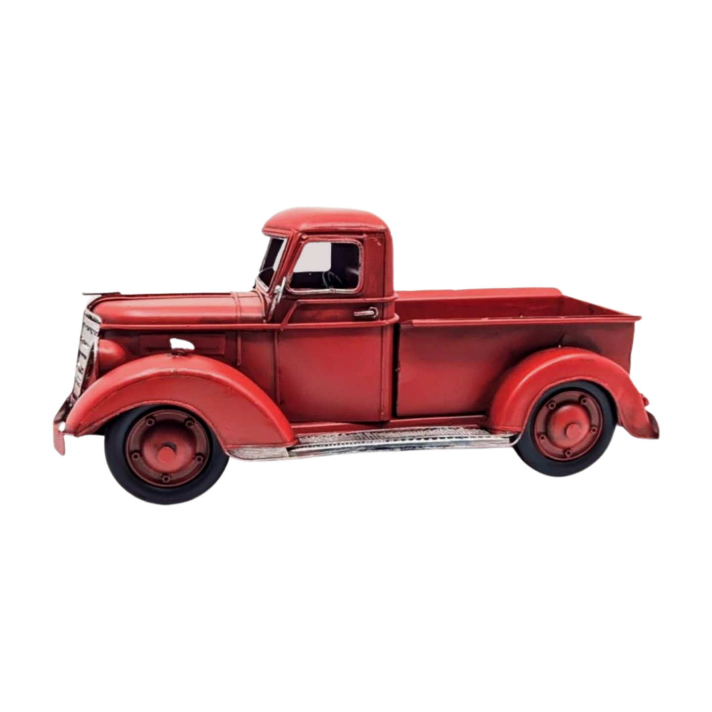
Vintage Metal Truck


$32.99

shop image

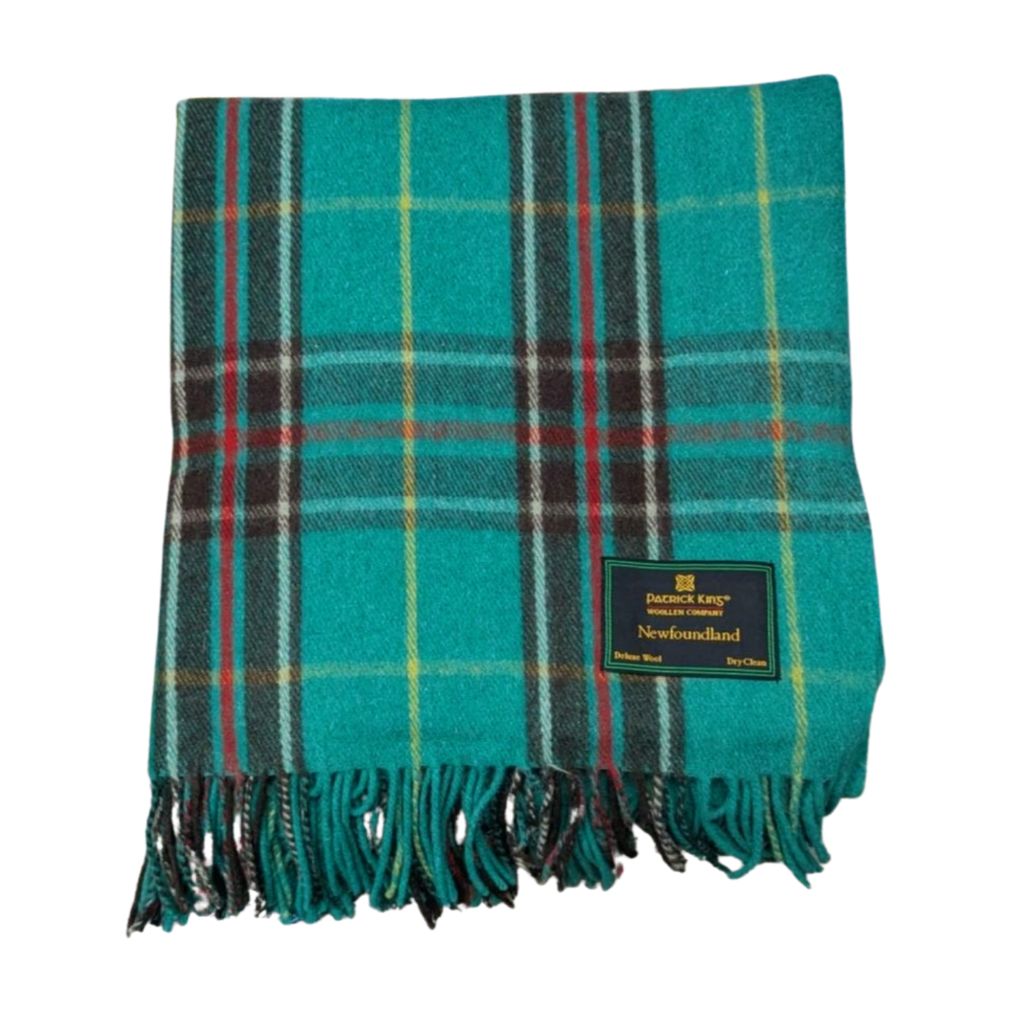
Newfoundland Tartan Wool Blanket


$79.99

shop image

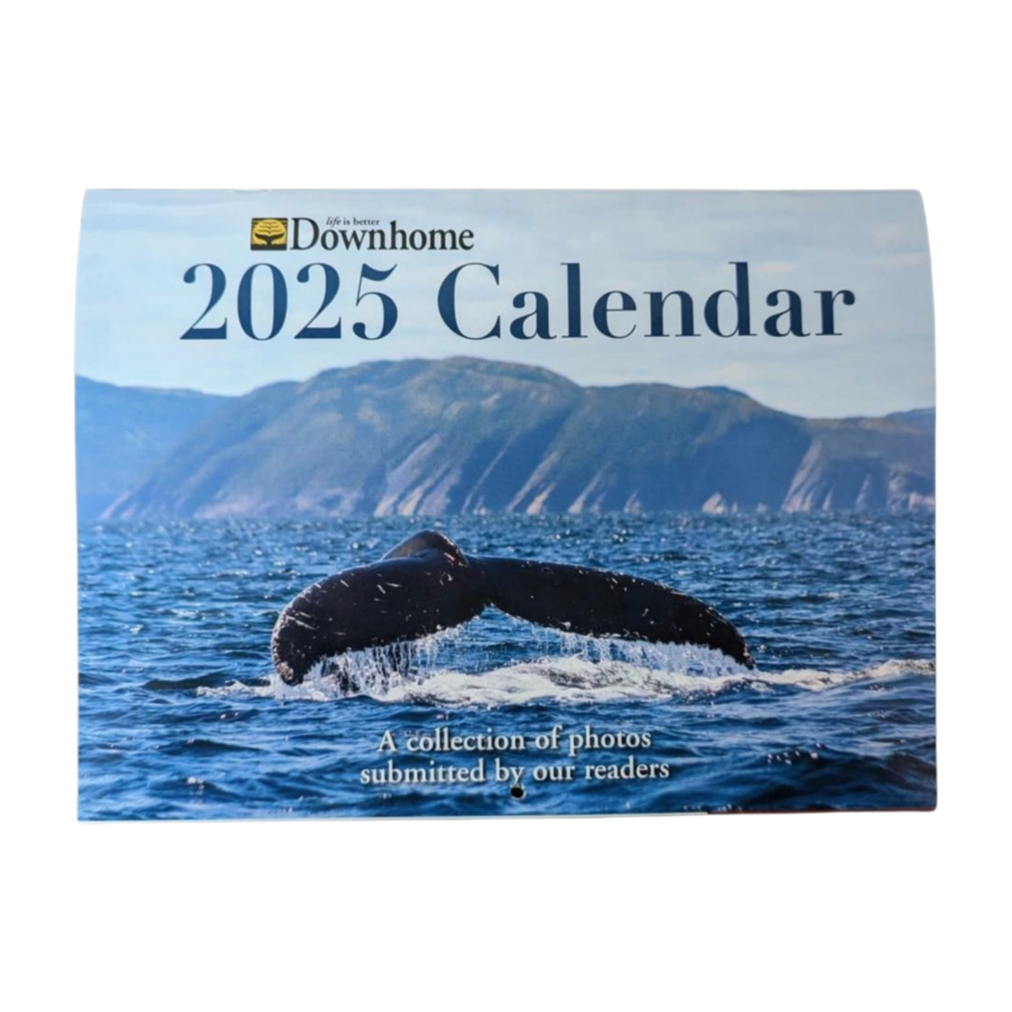
Downhome 2025 Calendar


$7.95

shop image

Gift Card: ShopDownhome.com


Downhome Logo
  • Magazine
  • Submissions
  • Contests
  • Shop
  • About
  • Advertise
  • Contact
  • Downhome Expo

Sign up for our newsletters with the latest promotions,sales, contests, and events!

©2024 Downhome Life, All Rights Reserved
  • Privacy Policy
  • Terms of Use
  • Accessibility
  • Sitemap
Design & Technology JAC
Facebook Button Twitter Button LinkedIn Button Instagram Button